Heuristic evaluation
A heuristics evaluation is a thorough and objective way to identify the most important usability hurdles or to compare two or more products in a fair way, using a set of design principles. The benefit of this method compared with an expert review is that it is more structured and might be more convincing to stakeholders.
Often used heuristics are the 10 Usability Heuristics for User Interface Design by Jakob Nielsen to assess usability. The UX honeycomb by Peter Morville gives a broader perspective because it assesses user experience.
The deliverable is a report with all observations, the evaluation, and conclusions. The evaluation is best done with two or three researchers, to make sure it is objective and to catch every observation. Two see more than one, three are even better!
The main challenge with this kind of project is scoping: you don't want to discount on the dept and quality of the observations, so make clear agreements on scope. Try to underpromise and overdeliver.
How it works
This step-by-step guide makes sure the evaluation is done in a structured and unbiased way.
- Start by familiarizing yourself with the product by clicking through it. Make some initial notes of what catches your attention.
- Choose a framework to base your assessment on. This will structure the findings and gives the outcome credibility. You can use the 10 Usability Heuristics for User Interface Design by Jakob Nielsen, or the UX honeycomb by Peter Morville. When choosing the set of heuristics, think of what the assessment should be about (e.g. for user experience you might look at the honeycomb, for usability Nielsen, for accessibility the W3C standards). You can also add the company's own design principles to the mix.
- Align your approach with the client. Include the steps, the scope, the framework, and how you will assign scores. Plan review moments with the client now, so they make time in their agenda.
Example heuristics evaluation outline
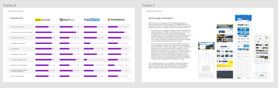
4 websites:
- Autoscout24(n|)
- Autotrack
- Move: Kijijiautos.ca
- Marktplaats - autosectie: www.marktplaats.nl/c/auto-s/c91.html
Focus on the following sections:
- Home page + basic search
- Advanced search
- Results page (both list view & grid view - if applicable) + Filtering results page
- Listing detail page
- Navigatie
Process
2 researchers, individually execute these activities for all 4 websites:
- Click around freely to become familiar with the product.
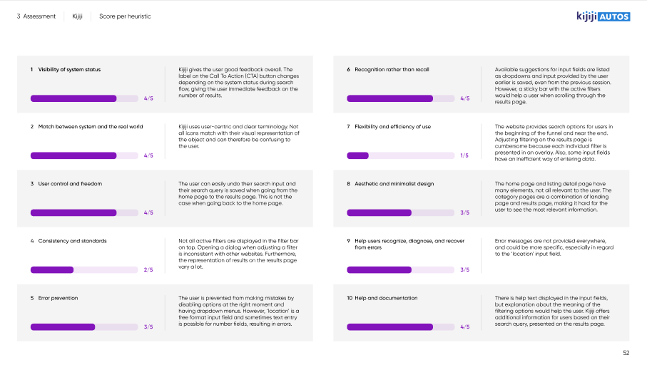
- Researches note down positive and negative findings linked to one of the 10 UX heuristics of Jakob Nielsen:
- Visibility of system status
- Match between system and the real world
- User control and freedom
- Consistency and standards
- Error prevention
- Recognition rather than recall
- Flexibility and efficiency of use
- Aesthetic and minimalist design
- Help users recognize, diagnose, and recover from errors
- Help and documentation
- Each give every heuristic a score of 1 to 5 (or N/A when the heuristic is not relevant).
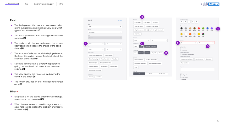
- Provide a short explanation and screenshot(s) to support the provided scores
Once these steps have been completed individually, scores are compared to each-other and an average of both scores is used as final score.
Together, a conclusion is written up to compare the 4 websites.
Deliverables
- PDF file in presentable format with 10-15 slides main story line and conclusions
- PDF file as appendix including the explanations of all scores (short text and screenshot(s) )
- Language: in English
- in Hike One branding
- Begin with the end in mind. Think of the structure of the report, how to present observations, and set some guidelines for writing. This is the best time to create templates and other assets. Don't reinvent the wheel, but get input from previous projects and reuse those assets.
- Start the assessment: do it individually to make sure you're as objective as possible. Makes notes of everything that catches your eye. Focus on the negative observations, but call out any outstanding positive observations as well.
- Merge the observations of all researchers so every researcher bases their score on the same information.
- Give scores individually, add your reasoning.
- Compare scores and take the average or agree on the final score.
- Summarize your findings and spend enough time on the summary and conclusions. Advisable to do this with the whole team. Take a step back from the details and discuss the bigger picture: what are the most important conclusions? This is what is most interesting to the client!
- Present the conclusions to the client and deliver the report
Tips
- Make sure you understand why the client is interested in this evaluation. What is the goal for them? This should not influence the outcome of the evaluation, but you can use it to make sure you report in a useful way.
- Try to surface the hypotheses the client has, but remain objective in your assessment.
- Fatigue and tunnel vision lie in wait, so frequent contact and close collaboration is key to this type of assignment. Consider setting up a war room, having enough breaks and snacks and make it fun for the team!
- Reuse as much as possible from previous assignments. Copy-paste the latest Figma file and start from there!
- You can create the presentation deck from Figma directly using this Plugin: https://www.figma.com/community/plugin/838925615018625519
- Ask others for help, for instance by sharing a screenshot on Slack:

Useful links
- See Dropbox for the report and Figma file of Marktplaats, project called 'gebruiksvriendelijkheid'. Rowan, Daisy, Katrien or Caya can tell you more.
- See the slides and recording of a presentation Katrien gave to everyone who was interested after the Marktplaats Heuristic Evaluation, in the Product development folder.
- Nielson Norman Group's 10 Usability Heuristics for User Interface Design
- https://www.interaction-design.org/literature/article/heuristic-evaluation-how-to-conduct-a-heuristic-evaluation
- https://blog.prototypr.io/10-usability-heuristics-with-examples-4a81ada920c